What Does a Resume Look Like? A Full Labeled Example
by Larbi SahliPublished
What does a resume look like? See one complete example with every part labeled and explained, the same page done badly, and a keep, maybe, leave-off checklist.
Users have landed jobs at
- 1Password
- OpenAI
- Notion
- justworks
On this page
A resume is one page, read top to bottom in a few seconds. Name and contact details at the top, a three-line summary under them, work history in reverse order with dated entries and short bullets, then education, skills, and any certification. That is the whole shape, and nearly every strong US resume follows it.
A description only gets you so far. If you have never written a resume, or your last one is ten years old, advice like "quantify your bullets" means nothing until you see a finished page with real numbers on it. So this page starts with one: a complete resume for a fictional office coordinator applying for an office manager job, with every part explained underneath. After that come the visual rules, a checklist of what to put on a resume and what to leave off, and the same top third done badly so you can see exactly what separates the two.
Every part of the resume, explained
Work through the example top to bottom. Each part below does one job, sits where it does for a reason, and ends with a rule you can apply to your own page.
1. The header
Your name is the largest text on the page, followed by phone, email, and city plus state. No street address: recruiters do not mail you anything, and the full address only invites commute-distance guessing. A LinkedIn URL earns its spot if the profile is current, and only then.
The rule: the header is the ways to reach you, nothing more. Four short items, one or two lines.
2. The summary
Three lines under the header: who you are professionally, your strongest proof, and the role you are aiming at. In the example, that means years of front-office experience, the standout result, and the words "office manager", because the summary is the one place you can name a target title you have not held yet. It replaces the old-fashioned objective, which told employers what you wanted instead of what you offer. If you want more patterns, the resume summary examples for 20 roles cover most situations.
The rule: two to three lines, one real number, and the title of the job you are applying for.
3. An experience entry
Each job gets a block: job title in bold, then employer, city, and dates in month-year form, with the most recent job first. The title leads because it is what a recruiter skims for; the employer and dates answer the next two questions, where and how long. Under that sit three to five bullets, and the most recent job gets the most.
The rule: title, employer, city, dates, every entry formatted identically, newest at the top.
4. One bullet, taken apart
The scheduling bullet in the example is the pattern to copy. It has three pieces: a verb (what you did), the action (the specific thing you changed or handled), and the result (the number that proves it worked). "Responsible for scheduling" has none of those pieces. "Rebuilt the appointment reminder process, cutting missed appointments" has all three, and it is the difference between a duty and an achievement. Not every bullet will carry a percentage, and that is fine; volume counts too, like calls per day or invoices per month.
The rule: verb, action, result. If a bullet has no result, find the volume, the frequency, or the scale, and put it in.
5. Education
Degree, school, city, graduation year, on one or two lines. With five years of work behind her, the example candidate's education sits below experience because it is no longer her strongest evidence. Coursework, GPA, and honors matter for recent graduates and fade fast after that.
The rule: once you have a few years of experience, education goes near the bottom and takes two lines at most.
6. Skills
A short list of concrete, checkable skills: software by name, systems, languages, specific processes. "QuickBooks", "vendor contract tracking", and "multi-line phone systems" are skills; "team player" and "hard worker" are adjectives. Applicant tracking systems, the software that stores and searches applications, match this section against the posting's wording, so use the posting's terms when they are true of you.
The rule: eight to twelve skills a stranger could test you on, phrased the way the job posting phrases them.
7. The certification line
Name, issuing body, year. That is the entire format. Placement is the real decision: when a posting requires the credential, it moves up next to the summary so nobody has to hunt for it; when it is a nice-to-have, the bottom is fine, as in this example. The full logic is in where to put certifications on a resume.
The rule: required credentials go near the top; supporting ones go at the bottom; either way, name, issuer, year.
What a resume should look like: the visual rules
Some searchers asking what a resume looks like mean the layout itself. The example follows six rules, and they cover almost every resume you will ever need to make.
- Margins between half an inch and one inch on all sides. Cramming the margins to fit more text is a signal you have not edited enough.
- One readable font for the whole document, in a size you would print a report in. Two fonts is a design project; one is a resume.
- Bold reserved for three things: your name, job titles, and section headings. If everything is bold, nothing is.
- Dates aligned the same way in every entry, all in the same format. Mixing "03/2021" with "March 2021" reads as carelessness.
- White space between sections. A recruiter should see where experience ends and education begins without reading a word.
- One page at this level of experience. The honest math on when two pages become right is in should a resume be one page or two.
The order of the page follows how it gets skimmed. On a first pass, a recruiter's eye lands on your name, drops to the most recent job title, checks the employer and dates, and only then reads bullets. That is why the newest job sits highest, why titles are bold, and why the summary exists at all: it is the one block that gets read before the skim starts. Nothing about the layout is decoration; every choice exists to survive a fast read.
What to put on a resume: keep, maybe, leave off
The other half of the question is content. Here is the full answer in one table: what always goes on a resume, what earns a spot only when it proves a requirement in the posting, and what stays off a modern US resume entirely.
| Always include | Include when it proves a requirement | Leave off |
|---|---|---|
| Name, phone, professional email | Certifications and licenses | Full street address |
| City and state (or metro area) | Projects relevant to the role | A photo (on US resumes) |
| A 2-3 line summary | Volunteer work that shows real skills | Date of birth or age |
| Work experience with titles and dates | Languages, with your level | "References available upon request" |
| Education | Awards with substance behind them | An objective statement, once you have experience |
| A skills section | A portfolio or LinkedIn link | Jobs from decades ago |
The leave-off column deserves a word, because most of it was standard advice a generation ago. Photos invite bias and many US employers discard photographed resumes to avoid discrimination exposure. The references line wastes a line saying something every employer already assumes. An objective tells the reader what you want, which is the one thing they are not evaluating. And jobs from twenty-plus years ago push your relevant work down the page while adding age as a data point you never chose to share.
The same top third, done badly
Picture the example above rebuilt the way a lot of template galleries still encourage. A headshot in the corner. A skills sidebar with four-out-of-five star ratings for "communication" and "MS Office". A summary that runs six dense lines of adjectives with no numbers. Dates written three different ways across two jobs. Same candidate, same history, and it would lose to the clean version every time.
Each of those choices fails for a specific reason. The photo triggers the bias problem above and can break parsing in the applicant tracking software that reads the file before a human does. Star ratings are unreadable to that software and meaningless to a recruiter, because four stars of "communication" measures nothing. The dense summary does not get read; a skimming eye bounces off any paragraph that long. And mixed date formats make a recruiter slow down to reconstruct your timeline, which is exactly the moment doubts start.
Beyond the top third, five mistakes sink more resumes than everything else combined:
- Typos, especially in the header and job titles, where they are read as a preview of your work.
- Duty lists instead of results: ten bullets that describe the job description rather than what you did with it.
- Inconsistent dates and formatting, which read as carelessness even when the content is strong.
- More pages than the experience justifies. Five years of work on three pages says you cannot prioritize.
- A generic summary that could sit on anyone's resume. If it does not name your field and a number, rewrite it.
How the picture changes for your situation
A first job, or no work experience yet

The structure holds; the order flips. Education moves to the top, and projects, coursework, and volunteer work do the job that employment history does in the example above. A bullet like "Built a supply-tracking spreadsheet for the school theater program, cutting reorder delays" proves the same verb-action-result skill as any paid work. Full pages at every stage are in the student resume examples.
A career change
The summary carries the weight: it must name the target role explicitly, because your job titles will not. Something like "Retail operations lead moving into HR coordination, with five years of scheduling, onboarding, and payroll support for 20-person teams" tells the reader how to interpret everything below it. Without that line, a recruiter reads your titles literally and files you under the old career.
A senior role
Two pages can be right once one page would hide real scope. A director with fifteen years should not compress "Led a 45-person operations team across three sites, managing a $12M budget" and its supporting evidence into the same space as a coordinator's history. The structure stays identical; the experience section simply earns more room, and early-career jobs shrink to one or two lines each.
What format is this?
The example uses the reverse chronological format, meaning jobs listed newest first, and it is the format the large majority of job seekers should use because recruiters and parsing software both expect it. The full comparison with functional and combination formats, and the narrow cases where those make sense, lives in the reverse chronological resume format guide.
What changes by field, and what never does
If you searched for what a resume looks like for your specific job, here is the honest answer: the structure you just studied does not change. What changes is the vocabulary and the emphasis. The skills section speaks the field's language, so a nurse lists clinical skills and unit types where the office coordinator lists QuickBooks and vendor management. Regulated roles, like nursing, dental hygiene, or teaching, move licenses and certifications up next to the summary because they are pass-fail requirements. Creative roles add a portfolio link to the header, because the work itself is the proof.
The candidate in this example would be applying against pages like the office manager resume example, which shows the same structure with the leadership keywords that role gets screened for. Find the example closest to your target job and compare it against this labeled page: the parts will match, and the differences will tell you exactly what your field weights.
The next step: build yours, part by part
You now know what every part of a resume does. The fastest way to make that stick is to build your own version of the page above: header, summary, newest job with verb-action-result bullets, then education, skills, and certifications. Roleframe's resume editor is free and needs no account, the templates follow the structure on this page, and the PDF you download has real selectable text with no watermark. What you see in the editor is exactly what the PDF is, which matters because parsing software reads the file, not your screen.
Frequently asked questions
- How do I write a simple resume?
Follow the structure on this page in order: a header with name, phone, email, and city; a two to three line summary with one number in it; work experience newest first, each job with a bold title, employer, dates, and three to five verb-action-result bullets; then education, skills, and any certification. Keep it to one page, one font, one column. Save and send it as a PDF so the formatting holds.
- What is a red flag on a resume?
The ones recruiters act on fastest are typos, unexplained date inconsistencies, and bullets that list duties with no results, because all three suggest the candidate did not care enough to edit. Photos, skill-rating graphics, and dense paragraph summaries are softer flags: they mark a resume as built from an outdated template. A gap in employment, by contrast, is far less of a flag than most people fear, especially when the summary or cover letter addresses it in one neutral line.
- What are three don'ts of resume writing?
Don't list duties without results; "handled invoices" tells a recruiter nothing that "processed 300+ invoices a month with zero payment disputes" does not say better. Don't decorate: photos, rating stars, and multiple fonts hurt both the human read and the software parse. And don't send the same resume to every job; the skills section and summary should echo each posting's actual wording where it is true of you.
- What is the standard format of a resume?
Reverse chronological: contact details and a summary at the top, then work history newest first, then education and skills. It is the format recruiters skim fastest and applicant tracking systems parse most reliably, and it is what the example on this page uses. Functional and combination formats exist for narrow cases, but if you are unsure, reverse chronological is the answer.
- What does a resume look like for a first job?
Same page, different order. Education moves to the top, and projects, coursework, volunteer work, and any part-time work fill the space that employment history fills for experienced candidates. Each item still gets verb-action-result bullets; a class project with a measurable outcome beats a paid job described in vague duties.
- Should a resume be one page or two?
One page for most people with under roughly ten years of experience, including the five-year candidate in this example. Two pages become right when one page would force you to hide genuine scope, which usually means senior, management, or long technical careers. The test is simple: if you are cutting results to fit, go to two pages; if you are stretching duties to fill, stay at one.

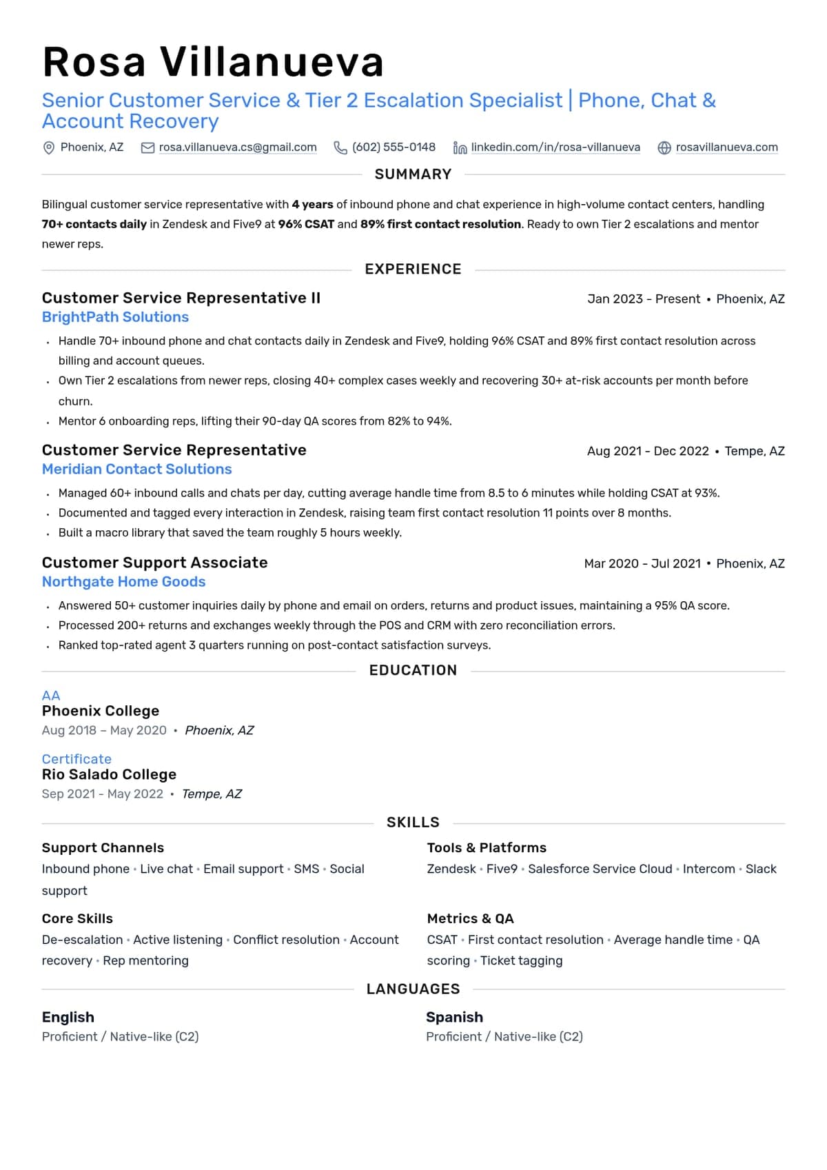
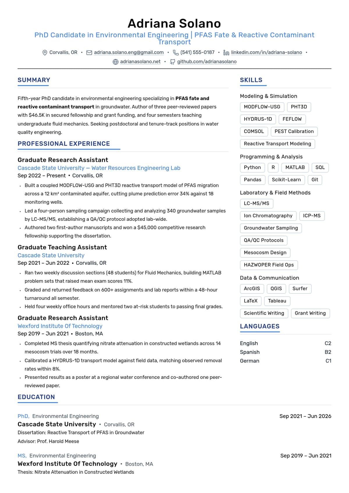
Build yours on the same template.
Every example here is built on a template you can open in the editor. Start from the same layout and write your own experience into it, then download the PDF free, with no watermark.


