What's the Best Font Size for a Resume?
by Larbi SahliLast Updated
Start with readable 10–12 point body text, then adjust for the font and layout. See a size hierarchy, font comparisons and export checks.
On this page
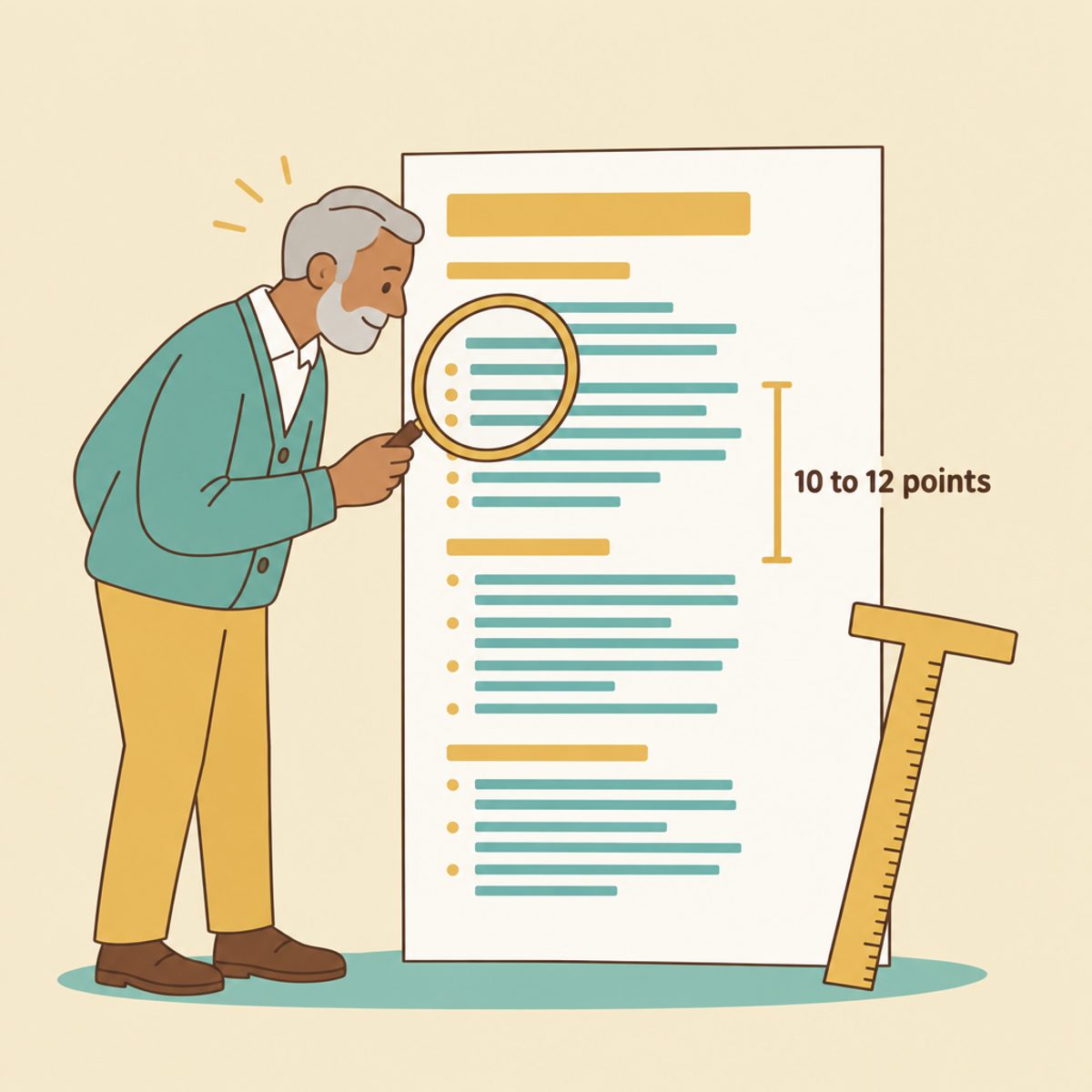
Try 11 or 12 points for resume body text, then check the actual font and exported layout. A 10–12 point range is a common starting recommendation, including in Harvard's resume guide. You can try 18–24 points for your name and 12–14 for section headings. These are design suggestions, not an ATS acceptance rule; any employer-specified formatting takes priority.
Start with readable body text
Choose the font first, then set the body size and read a full page. Start at 11 or 12 points rather than immediately compressing the text to fit. If a particular font looks small, increase it. If a larger size makes the document longer, review the content and page requirements before shrinking it.
Check the resume on screen at normal viewing size and, when practical, in a printout. Ask another person to read contact details, dates and a few bullets. Use a larger size if that improves access for your audience; 12 points is not a maximum imposed on every resume.
The following hierarchy is a starting template:
| Resume element | Starting size | What to check |
|---|---|---|
| Your name | 18–24 pt | Prominent enough to identify the document, without crowding contact details. |
| Section headings | 12–14 pt | Distinct from body text through size, weight or spacing. |
| Job titles and company names | 11–12 pt | Readable at the body size; optional bolding can distinguish titles. |
| Body text and bullets | 10–12 pt; try 11 or 12 first | Comfortable reading in the actual chosen font and exported file. |
| Contact information and dates | Start at the body size | Do not shrink important details just to keep a line from wrapping. |
Apply the same style to equivalent elements. If Experience is a bold 13-point heading, use that treatment for Education and Skills as well. Consistency gives the reader a predictable way to navigate the page.
Header and name font sizes: hierarchy matters
Make your name easy to find without letting it displace important content. A long name may need a different size from a short one; preview it with the contact line rather than choosing the size in isolation.
Headings can stand out through weight and spacing as well as size. Keep enough space above a new section to distinguish it from the last bullet. Avoid reducing spacing so far that sections run together.
Keep contact information and dates readable. If the contact line is too long, remove an unnecessary field or let it use two lines instead of making the text much smaller.
When smaller text becomes a poor space-saving choice
If you are considering 9-point text to force the resume onto one page, pause and review the layout. Small text can be harder to read, particularly when a viewer reduces the page to fit a screen. Try these checks first:
- Remove repeated bullets and details that do not support this application.
- Check whether a fixed page limit actually applies. If it does, prioritize the required evidence.
- Review oversized headings, empty lines and unnecessary contact fields before reducing body text.
- Compare the exported versions side by side and keep the one that is readable at a normal viewing size.
Relevance helps decide what to shorten. Our guides to selecting work history and choosing bullet detail provide ways to reduce repetition. Older work may still deserve space when it supplies important evidence.
Adjust margins and spacing carefully, keeping the page comfortable to read and printable. For a U.S. federal application, consult the specific USAJOBS formatting and page guidance rather than assume advice for a general resume applies unchanged.
How different fonts affect apparent size
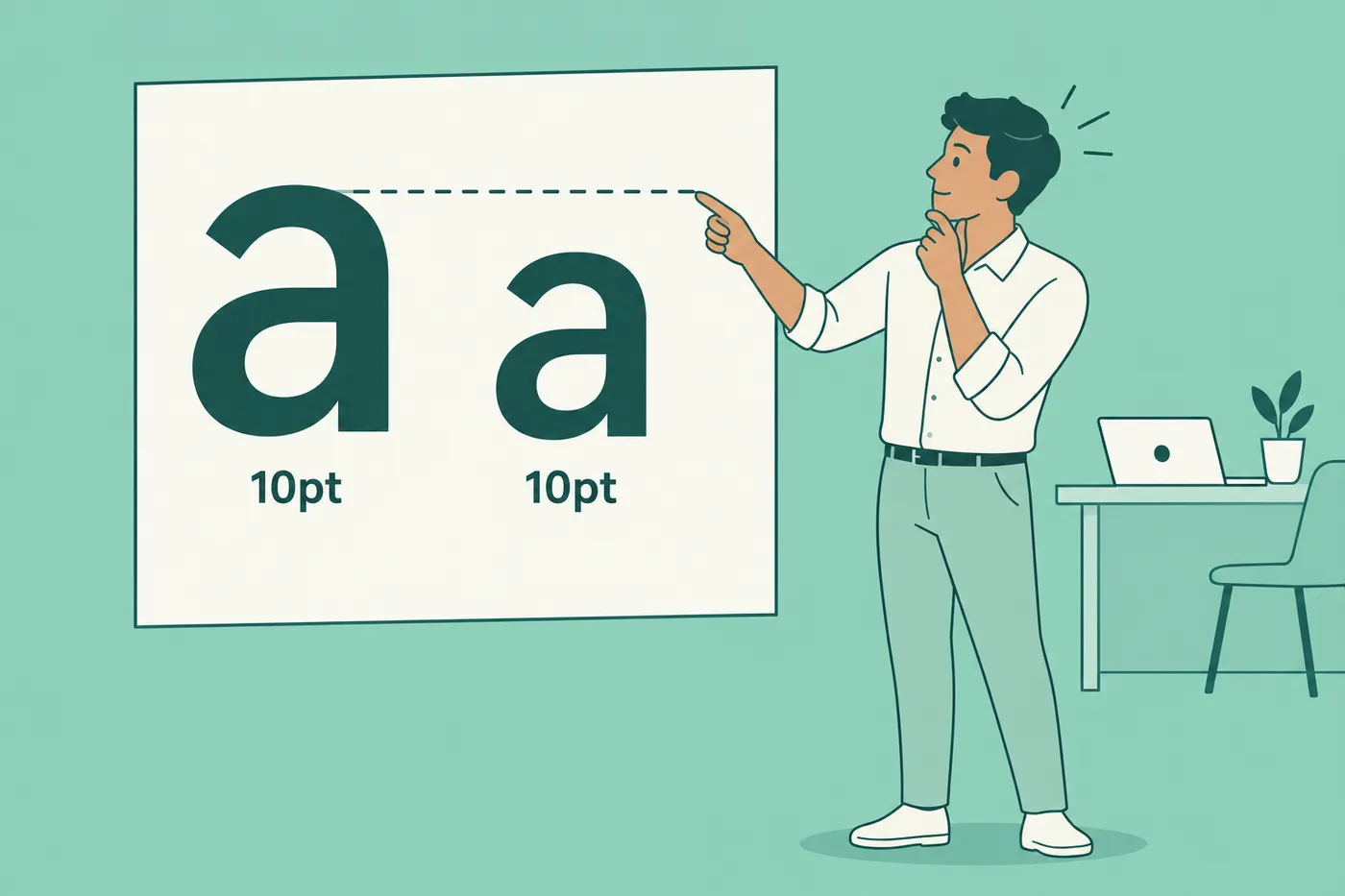
The same point size can look different in different fonts. Letter proportions, stroke weight and spacing all affect the result. One relevant measure is x-height, the height of lowercase letters such as "x"; MDN's font-size-adjust documentation explains its relationship to apparent text size.
Use the table as a shortlist of fonts to compare, not a ranking of recruiter preferences. The sizes are trial settings for a sample paragraph:
| Font | Style | Trial body size | What to compare |
|---|---|---|---|
| Calibri | Sans serif | 11–12 pt | Read a full bullet and check dates and contact details at the exported size. |
| Arial / Helvetica | Sans serif | 11–12 pt | Check line wrapping and confirm the intended font is available in the export. |
| Georgia | Serif | 11–12 pt | Check spacing and the number of lines in longer bullets. |
| Garamond | Serif; versions differ | 12 pt as a first trial | Increase the size if the actual font appears too small. |
| Times New Roman | Serif | 11–12 pt | Check readability and hierarchy rather than assume the font looks dated. |
| Cambria | Serif | 11–12 pt | Compare the same paragraph with your other shortlist options. |
To compare fonts, use the same resume text and page settings for each version. Read the smallest elements, not only the name at the top. Inspect the exported PDF or other required format because line breaks and font substitution can change the result.
You do not need an unusual typeface to make the document distinctive. Accurate, well-organized content and a consistent layout are more useful goals than guessing a recruiter's preferred font.
Does font size matter to the ATS?
Choose font size primarily for people reading the resume. It does not establish whether an applicant tracking system can extract the document correctly. Greenhouse documents potential parsing problems involving image-only resumes, complex layouts and unclear sections; that is different from a universal point-size threshold.
Use real, readable text and clear headings. In a PDF, test whether you can select and copy a few lines, then check that the copied text is in a sensible order. This is a useful check, not a complete simulation of an employer's parser. Review any fields the application auto-fills from your upload.
Use relevant terms openly and accurately; avoid hidden or tiny keyword text. Our keyword guide covers wording, and the ATS-friendly format guide covers layout. Submit the file type requested by the employer, whether PDF, DOCX or another accepted format.
Check typography in the finished document
A template can give you a starting hierarchy for names, headings and body text. In Roleframe's resume builder, choose a layout and inspect it with your own content, especially long titles, dates and contact lines.
After editing or tailoring a version, export it and check every page for cramped text, awkward breaks and missing content. Our base-resume and tailored-version guide explains how to manage the application copies; each finished file still needs its own review.
Frequently asked questions
- Is 10-point font too small for a resume?
It may work in some fonts and layouts, but inspect the actual document. If the text looks cramped at normal viewing size, try 11 or 12 points and shorten repetitive content. Follow any minimum size specified by the application.
- Is font size 11 or 12 better for a resume?
Both are reasonable starting points. Compare them in your chosen font with the actual resume text, then choose the more comfortable version that meets the page requirements. Do not use 12 merely to fill empty space or 11 merely because someone calls it a universal default.
- What font size should I use for a two-page resume?
Use the same readable hierarchy you would use on one page. Page count does not require smaller text. Check that both pages have consistent body, heading and date styles, and follow the employer's length limit.
- What is the most attractive font for a resume?
Choose a clear font you can export reliably. Calibri, Arial, Georgia, Cambria and Times New Roman are examples to compare. Consistent sizing, readable spacing and clear content matter more than choosing a typeface based on assumed recruiter taste.
- What font size should section headings be on a resume?
Try 12–14 points, adjusting to the body font and layout. Weight and spacing can also distinguish a heading. Use the same treatment for equivalent sections and check the exported file.
- Should my cover letter use the same font size as my resume?
Matching the font family and general hierarchy can make the documents feel consistent. The body sizes do not have to be identical if a different size improves readability. Review each document in its final format and follow any application-specific instructions.



Ready to start your new resume?
Writing a resume takes time, and even a polished one can miss what a hiring manager is looking for. Roleframe helps you build a clear, ATS-safe resume in minutes and tailor it to the job you want.


